
A histogram is a chart presentation of data grouped in equal intervals. In this step by step article, we will show you how to make a pivot chart histogram in Excel using pivot table as a data source. A histogram is often used to present the number of students with a number of points in a range (55-64, 65-74, 75-84, etc.) or a number of people in age groups (0-7, 8-15, 15-22, 23-30, etc.).
In this article, we will explain a histogram usage on the example of multiple product sales. We will present a number of sales within several equal sales intervals (210-309, 310-409, etc.).
Creating the Data Source for the Pivot Table
To be able to create a pivot table and chart, we need to set up the table with data first. Let’s look at the data that we will use:
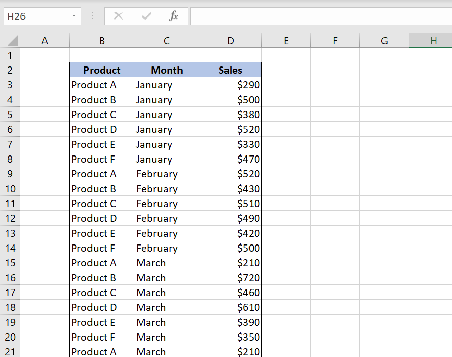
As we can see in Image 1, our table in Worksheet “Table” consists of 3 columns: “Product” (column B), “Month” (column C) and “Sales” (column D). This table will be the data source for the pivot table. In the pivot table, we want to present the number of sales in each interval. Intervals are grouped by 100 (210-309, 310-409, etc.).
Creating the Pivot Table
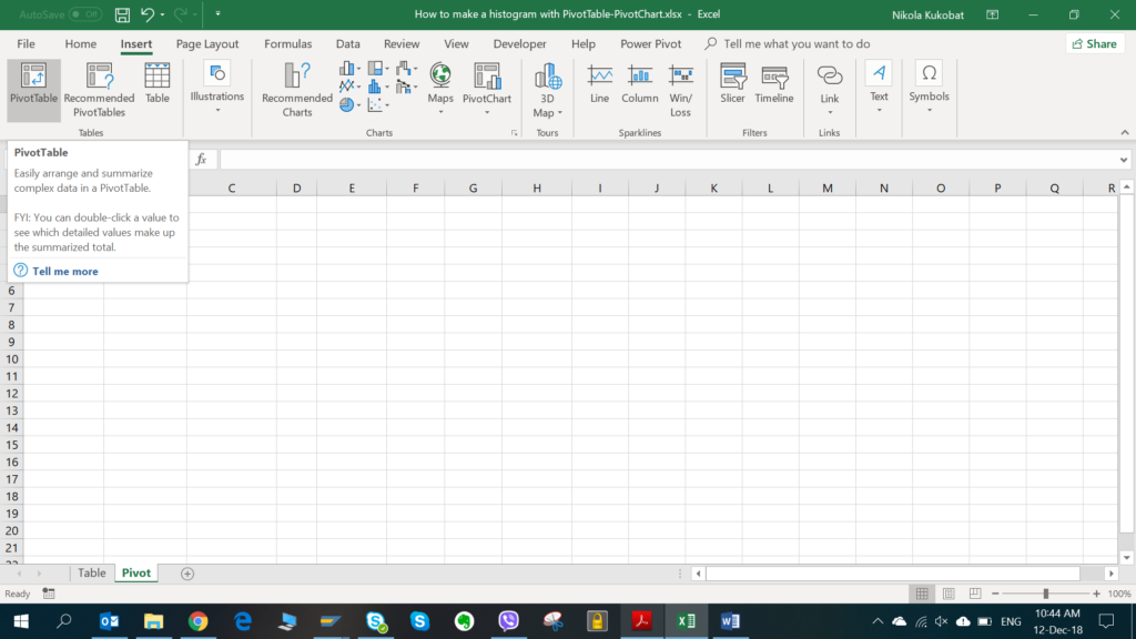
Now when we have data ready, we can create the pivot table. First, we will create a new Worksheet called “Pivot”. In the Insert tab, we choose button “PivotTable”.
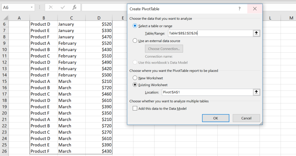
In the popup screen, we need to select a table in “Table/Range” option. In our case, the range is B2:D26 on Worksheet “Table”. We included the whole table including the header.
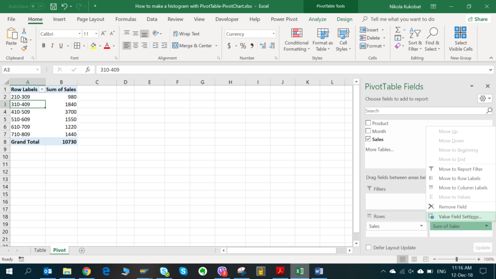
Now we need to choose fields in order to create the pivot table. We can drag and drop the “Sales” field into Rows and values:
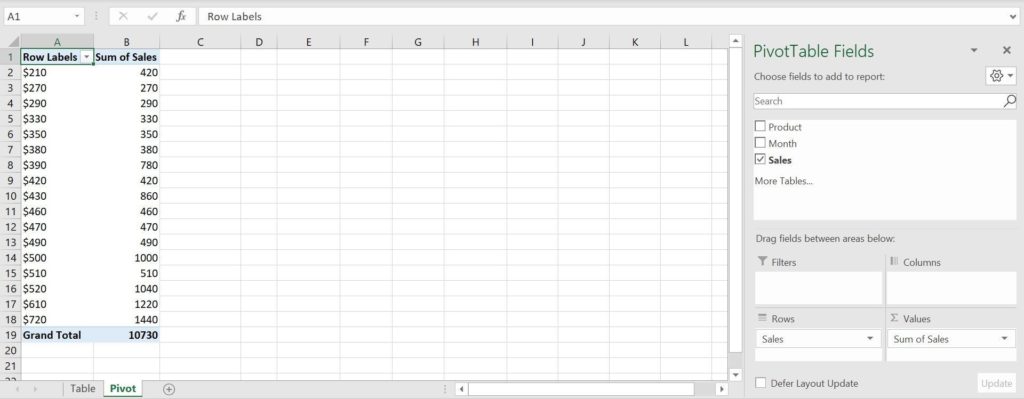
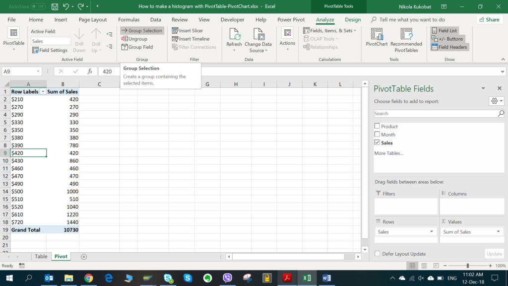
As we can see in Image 4, the pivot table is created, but we need to set the data appropriately, so we can create a histogram. First, we will group row labels (Sales) in equal intervals of $100. To do this, we need to select any value in the first column. In the Analyze tab of PivotTable Tools, we need to choose “Group Selection” button:
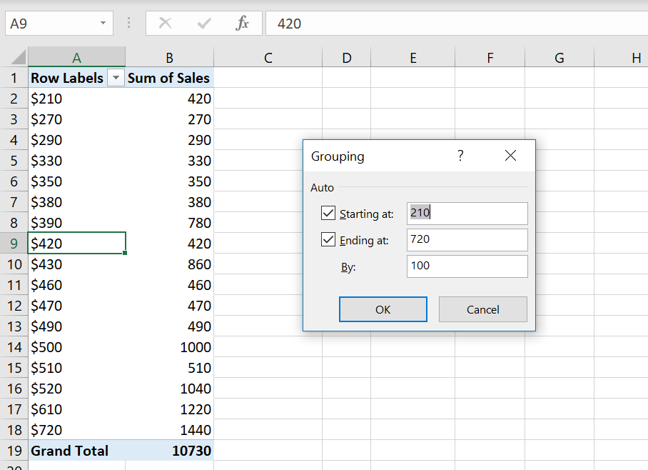
In the pop-up screen for grouping, we need to define the intervals start, end and length. By default, start and end are the minimum and maximum value from the range. For intervals length we set 100:
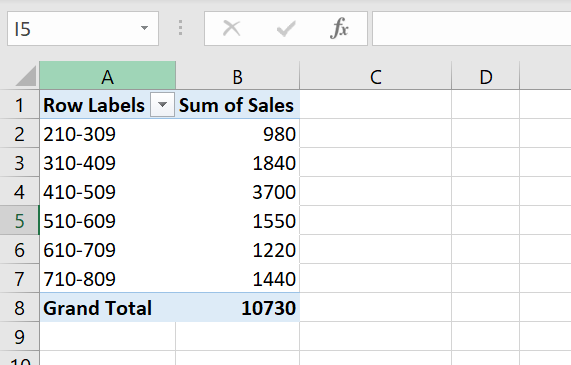
As a result, we have the pivot table with row labels grouped in intervals of $100, as presented in the Image 7:
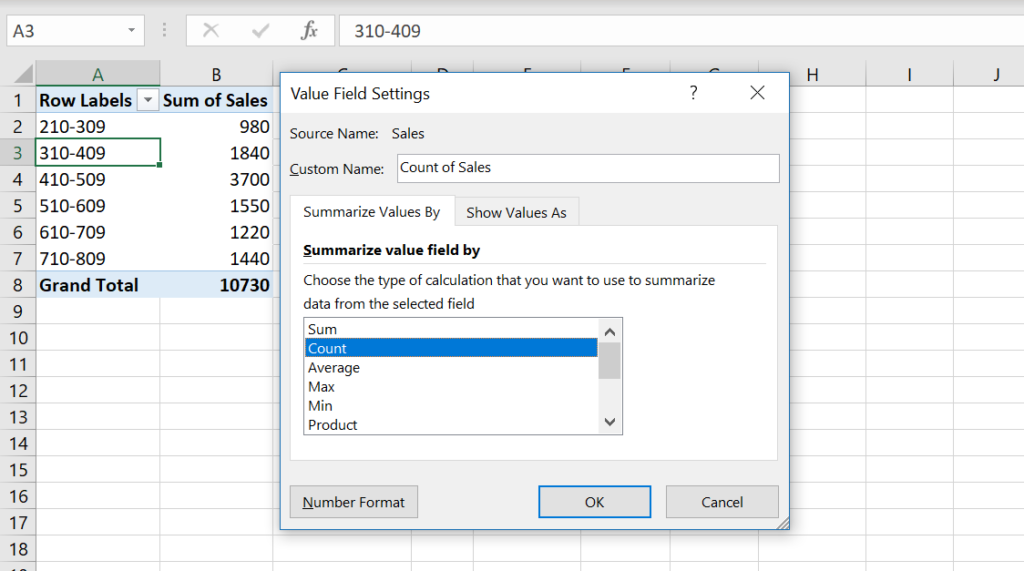
As you can see, we need to adjust the second column, as we currently have the Sum of Sales. Instead, we want to know how many sales belong to each interval. Therefore, we have to change this column to count of sales. In order to achieve this, we need to click on the pivot table, to get PivotTable Fields window on the right side. In the Values part, click on the Sum of Sales field and choose “Value Field Settings” option:
In the pop-up window, we need to choose “Count” option, under Summarize Values By tab:
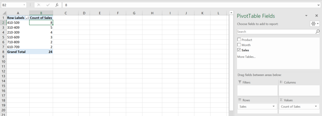
After changing field settings, we have the second column renamed to “Count of Sales” with counted sales by intervals. Also, in PivotTable Fields, under Values, the field name is changed from the “Sum of Sales” to “Count of Sales”.
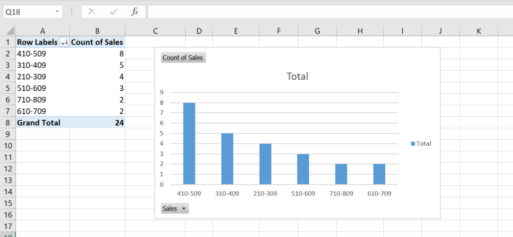
We also sorted the pivot table by “Count of Sales” in descending order. To do this, we select any value in this column and choose “Sort Largest to Smallest” option under the “Sort & Filter” button in Home tab. In Image 10, you can see the completed pivot table:
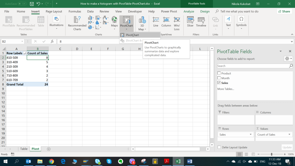
Now when we have data prepared in the pivot table, we can create the histogram chart, using pivot chart.
Creating the Histogram with the Pivot Chart
To create the histogram chart, we will create a column chart from the pivot table and adjust it a bit. First, we need to insert a chart. We select any field in the table, in the Insert tab click on the PivotChart button and choose “PivotChart” option:
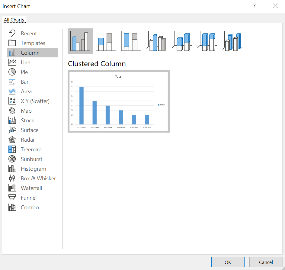
In the pop-up window for chart insertion, we choose the suggested option – Clustered column chart:
As you can see in Image 13, we get the chart presenting the number of sales in each interval:
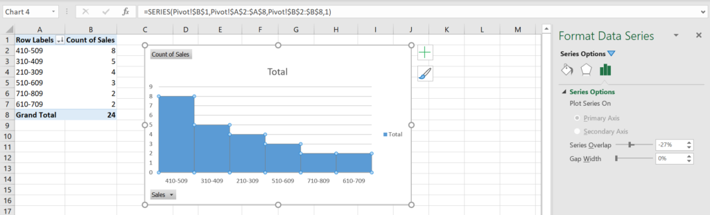
To make the chart looks like histogram, we need to adjust the columns by deleting empty spaces between them. To enable that, we need to right click on any column and choose “Format Data Series” option. In new window on the right side, we need to set Gap Width to 0%. Now empty spaces between columns are removed and we have the histogram representing Number of sales by intervals of $100:
Sorting the Histogram by Sales Intervals
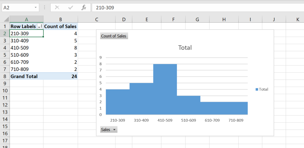
As you can see in Image 14, we sorted the table descending by the count of Sales (Y-axis). Another way of displaying the chart is to sort it ascending by sales intervals (X-axis). In order to do this, we need to sort the pivot table ascending by Row Labels. Click on any Row label cell and choose “Sort Smallest to Largest” option under the “Sort & Filter” button in Home tab. As a result, our histogram is sorted ascending by sales intervals (210-309, 310-409, 410-509, etc.):
Conclusion
In just a few steps we’ve created a histogram in Excel with a help of a pivot table and a pivot chart. For more Excel tips, take a look at our other posts from the menu bar.