
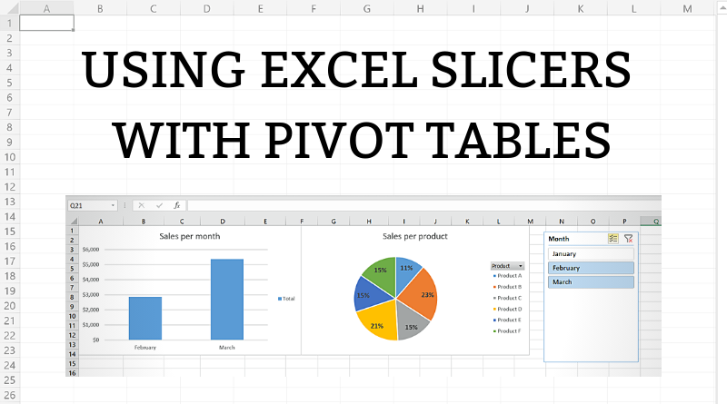
A slicer in Excel is a user-friendly tool which allows to filter pivot tables. It is an advanced version of the standard filter option available for pivot tables. Apart from filtering a single pivot table, slicers are often used in dashboards for filtering several pivot tables and charts together.
In this article, we will cover the step by step process of creating slicers to filter pivot tables easily. Also, we will explain how to connect a single slicer to several pivot tables.
Difference Between Filtering with Slicers and a Standard Filter
As we mentioned in the introduction, slicers have several advantages over the standard filters in pivot tables:
- The standard filter is filtering all the fields in a table separately, while the slicer takes into account all the fields. For example, if we have fields Country and City and filter one country with a standard filter, we will still have a possibility to filter all the cities, even the ones not belonging to the filtered country. On the other side, if we use a slicer to filter one country, a slicer for cities will allow us to filter only those cities belonging to the filtered country.
- Another drawback of standard filters is related to selecting multiple items. When we filter multiple items, we can’t see which items are selected, unless we click on the drop-down menu. This is not very useful if a table needs to be printed or shared in a presentation or a PDF document. Slicers, with their user-friendly layout, enable us to see what items are selected. We will look into this further later on in the tutorial.
- The standard filter allows us to filter only one field in one pivot table, while the slicer can be connected to multiple tables containing the same field. This enables the user to filter multiple pivot tables with a single slicer.
Creating a Slicer for the Pivot Table
We will now explain based on an example how to insert a slicer into the pivot table. First, let’s look at the table which we will use for creating the pivot table:
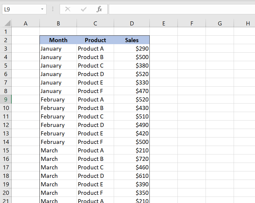
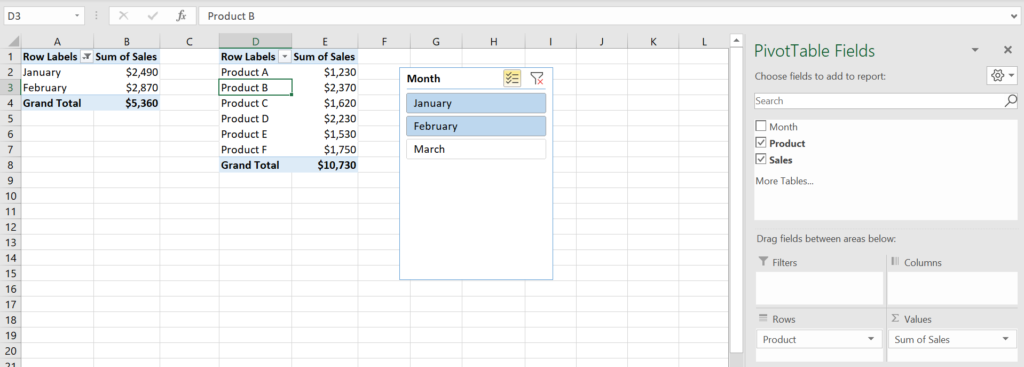
Our table represents the sum of sales per month and product. The table consists of 3 columns: “Month” (column B), “Product” (column C) and “Sales” (column D).
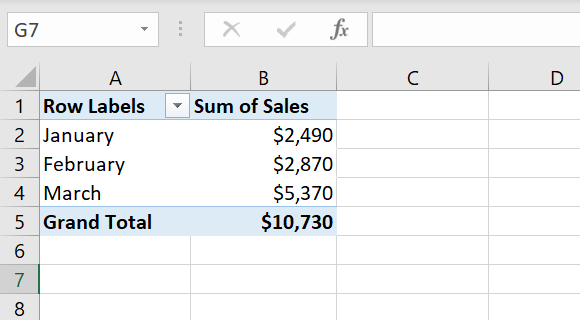
We created a pivot table based on this table. In the pivot table we want to present the sum of sales per month, so we put field “Month” in Rows and field “Sales” in Values. The result is a pivot table shown in Image 2:
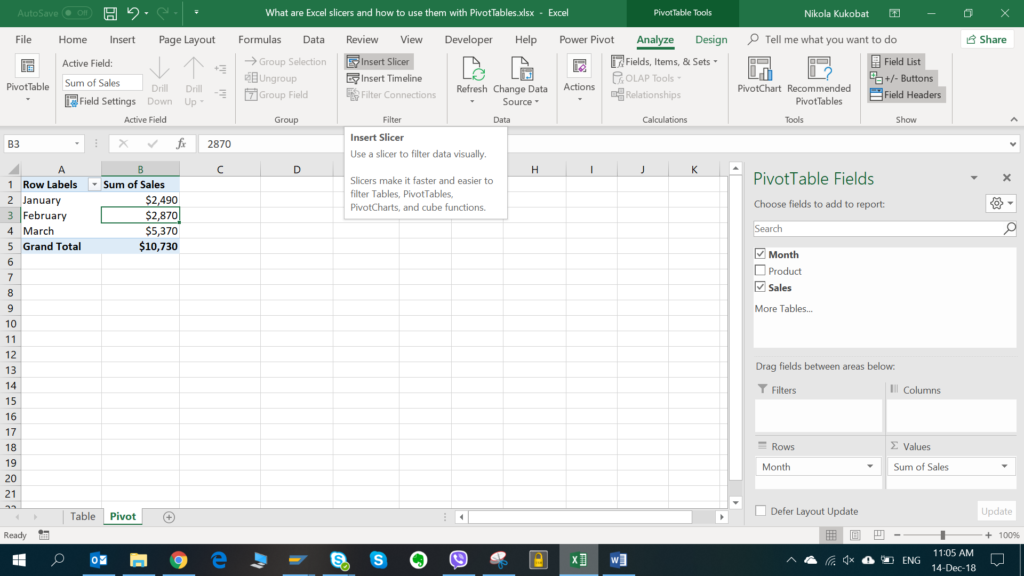
Now we want to filter our pivot table by month, using a slicer. To insert a slicer, we need to click anywhere on the pivot table, choose the Analyze tab in the PivotTable Tools and click on the “Insert Slicer” button:
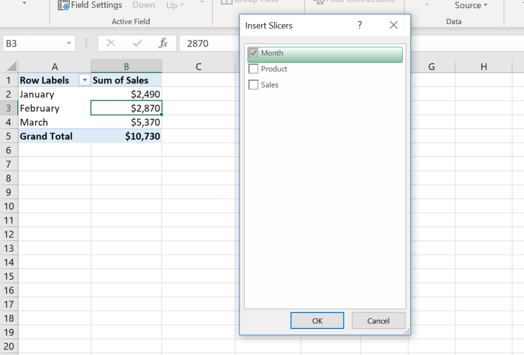
On the pop-up screen we need to choose a field that we want to filter, in our case “Month”, and click OK:
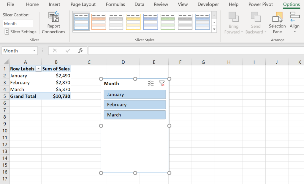
As a result, we get the slicer with all the months from the pivot table, as shown in Image 5:
To see more design options for the layout, such as size, styles and text, we need to click on the slicer and choose the Options tab under Slicer Tools.
Enabling Multi-Select for Excel Slicers
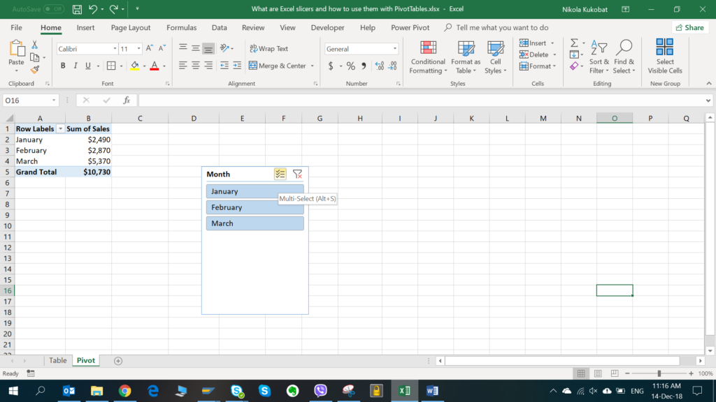
The filter is by defaul enabled to choose only one item. We can enable multi selection by clicking on the “Multi-Select” button in the Slicer.
After we enable multi-selection, we want to display the sum of Sales for January and February, so we will choose these two months in the slicer:
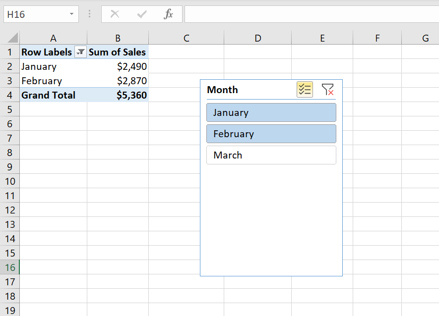
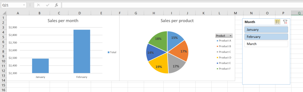
As you can see in the picture, the “Multi-Select” button is now colored in yellow and filtered values are highlighted with blue. In our example slicer, the pivot table shows January and February.
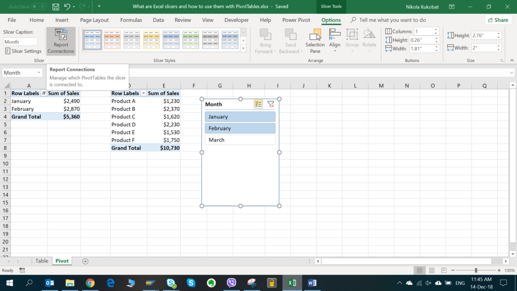
Connecting a Slicer with Multiple Pivot Tables
As we explained in the introduction, slicers can filter multiple pivot tables at once, if they contain the same filter field. In the next example, we will see how to enable this. First, we will create another pivot table from the same data table, which will display the sum of sales per product:
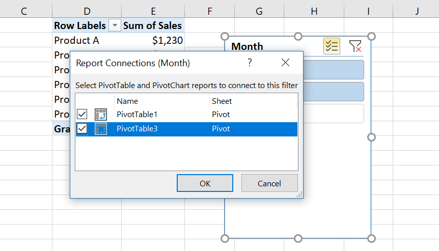
The second pivot table currently displays all the results from the data source, regardless of the slicer values selected, because it’s not connected to any slicer. In order to connect this pivot table to the same Month slicer, we need to click on the slicer and choose the “Report Connections” button from the Options tab under the Slicer Tools:
On the pop-up screen, we can see that only the first pivot table is connected to the slicer. In order to connect the second one as well, we need to check it and click ok:
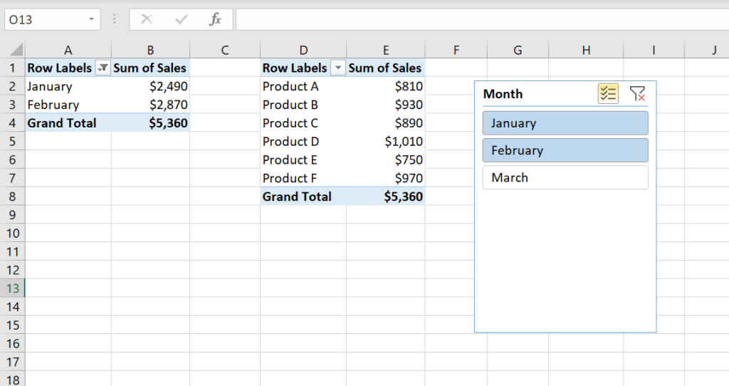
After connecting the slicer, both pivot tables are filtered for the January and February, as we can see in Image 12:
Using a Slicer to Filter the Pivot Charts
Another use for Excel slicers is filtering pivot charts which are created from pivot tables. Similarly to filtering pivot tables, slicers can filter multiple charts created from connected pivot tables. This option is often used in dashboard creation when we need to filter several charts with the same data.
In order to display how this option works, we will create two charts from two pivot tables used in the previous example:
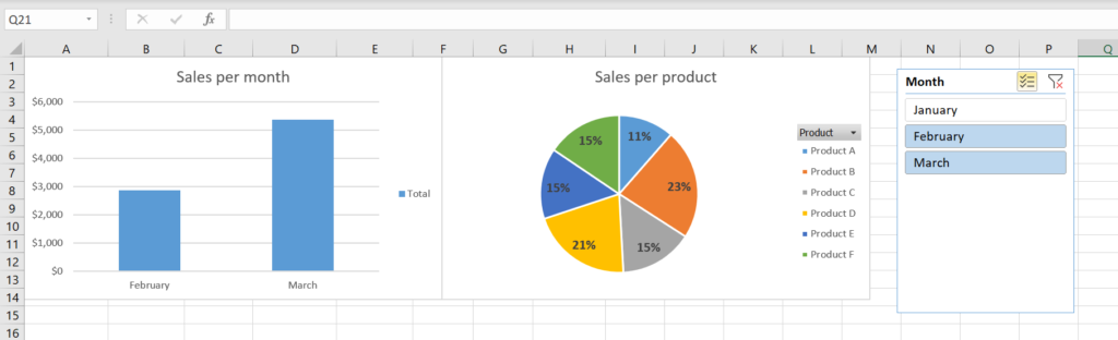
In Image 12, we chose January and February in the slicer, while in Image 13, we chose February and March. If we compare both images, we can see that both charts are updated according to the filtered months in the slicer.
Final Thoughts
In conclusion, Excel slicers can be a very useful tool for filtering and displaying data, be it for presentation purposes or a PDF printout. Do you find them useful in your work? If so, let us know in the comments below!